Brand Identity Design for Ecommerce That Puts Sellers First
Client Overview
Pratham is a seller partner programme from Flipkart Ads, built around its Partner Meet series. It brings together sellers who have grown their businesses through Flipkart Ads to celebrate success, share knowledge and build a community through real, on-ground interaction.
About Project
Flipkart Ads engaged Umanshi to create Pratham’s complete identity. This was brand identity design for ecommerce at community scale: brand philosophy, logo, tagline, tone of voice and guidelines for an IP that had to work across regional languages and on every event touchpoint.
Challenge
An IP of Its Own
Pratham needed an identity sellers would recognise and feel part of, carrying the credibility of Flipkart Ads without being overshadowed by the parent brand.
Speaking to Sellers Across India
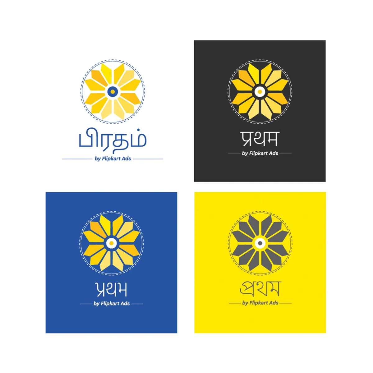
The audience spans sellers from many regions and languages. The identity had to read clearly in English and in regional scripts, from Hindi and Tamil to Gujarati and Bengali.
Built for the Event Floor
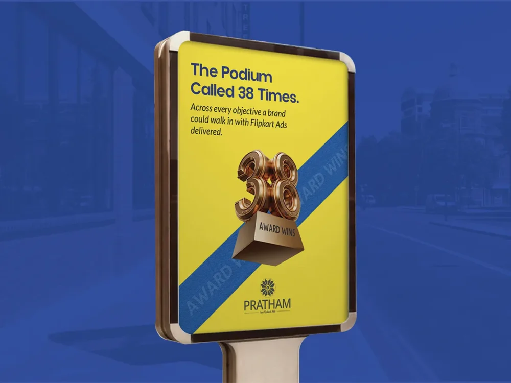
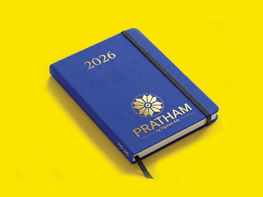
Pratham lives at Partner Meets. The brand had to work across every on-ground touchpoint, from standees and podiums to badges, diaries and bags, without losing consistency.
Our Strategy
One Belief: You Come First
Pratham means “first” in Hindi. We built the brand on that meaning, putting the seller at the centre, and defined four pillars to guide it: recognition, knowledge, trust and inspiration. The tagline, “Where you come first!”, carries the idea everywhere.
A Symbol of Growth
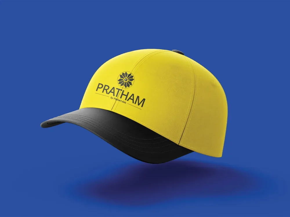
A flower of radiating gold petals represents growth and opportunity, with a blue centre that ties it back to Flipkart Ads. A bold PRATHAM wordmark leads, with “by Flipkart Ads” as a supporting subtag that can drop when the parent logo already appears.
A System Ready to Scale
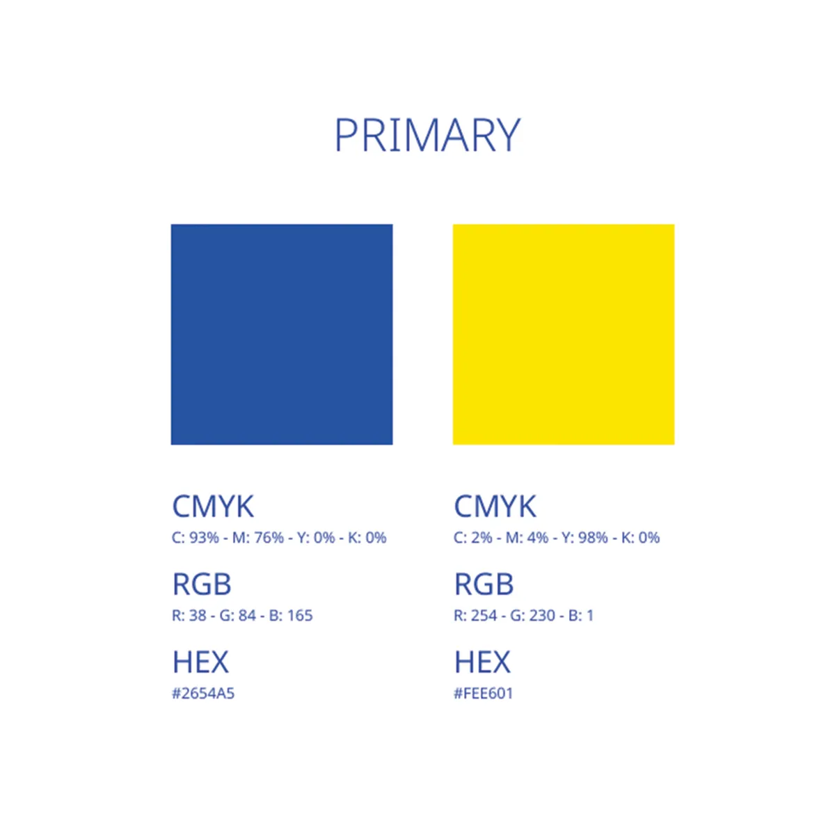
Detailed guidelines cover logo lockups, multilingual versions, clear space, colour, typography, tone of voice, misuse cases and logo-on-image rules, while merchandise and event templates show the brand applied consistently on the ground.
Built for Business Outcomes
DISTINCT SELLER IP
Gave Pratham its own recognisable identity within Flipkart Ads.
MULTILINGUAL SYSTEM
Built one identity that reads consistently across regional languages.
EVENT-READY BRAND
Equipped every Partner Meet touchpoint with consistent branding.
Brand Identity Design for Ecommerce: FAQs
What does brand identity design for ecommerce programmes include?
Strategy as well as visuals. For Pratham, brand identity design for ecommerce sellers covered the brand philosophy, logo, tagline, colour, typography, tone of voice, multilingual lockups and guidelines for events and merchandise.
How do you stop a sub-brand from getting lost under its parent?
Give it its own meaning and visual signature, then link it back deliberately. Pratham leads with its own wordmark and flower symbol, while the blue centre and the "by Flipkart Ads" subtag connect it to the parent.
Why do multilingual logo lockups matter in India?
Because the audience reads in many scripts. Pratham's identity works in English and in regional scripts including Hindi, Tamil, Gujarati and Bengali without losing consistency.
Does Umanshi create identities for ecommerce and digital businesses?
Yes. Umanshi provides brand identity design for ecommerce, D2C and digital businesses, from naming and strategy to logos, guidelines and merchandise.
What should brand guidelines include?
Logo usage and lockups, clear space, colour, typography, tone of voice, imagery rules and examples of misuse. Good guidelines also show the brand applied to real touchpoints, so teams and vendors can use it correctly without checking every decision.