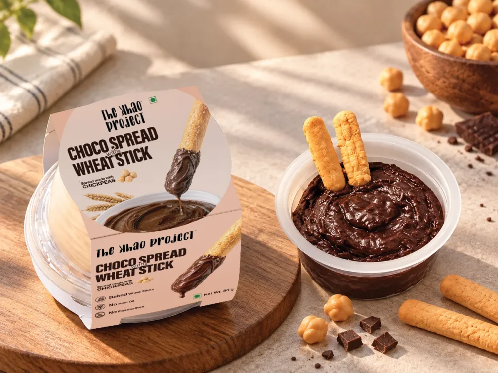
The Khao Project is a D2C food brand making spreads with a chickpea twist, starting with a chocolate spread. It needed food packaging design that would win over parents, young families and busy professionals, pairing real indulgence with a better-for-you ingredient story: 45% less fat and no palm oil.
About Project
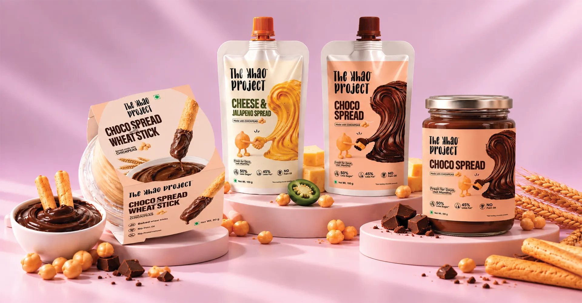
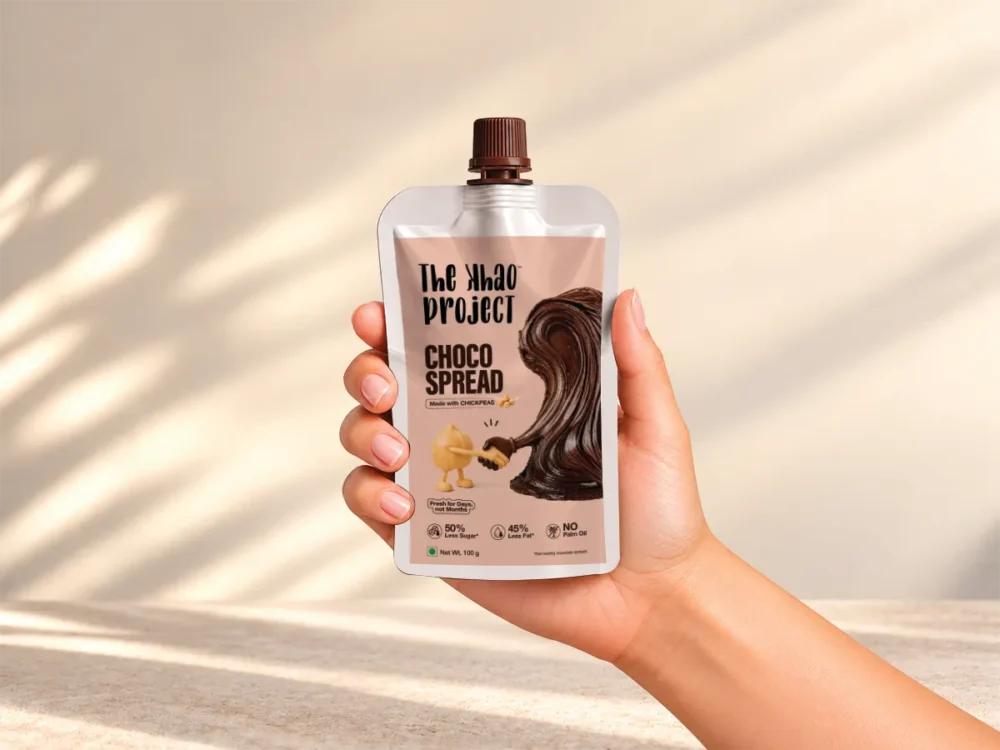
The Khao Project engaged Umanshi to design labels for its launch range: a squeeze pouch, an on-the-go spread-and-breadstick pack and a jar. We explored ten distinct visual routes, grouped them into indulgent-led, ingredient-led and premium territories, then refined the chosen direction into a label system where indulgence is the hero and the chickpea story is the differentiator.
Challenge
Indulgence vs Nutrition
The pack had to make the product crave-worthy and help parents trust it in the same glance. Lead with health and it feels functional. Lead only with chocolate and it loses its reason to exist.
A Crowded Spread Shelf
Mass indulgent spreads own craving, while clean-label brands own health. The food packaging design had to look as appetising as the category leaders, with a better-for-you signal that never felt preachy or clinical.
Making Chickpeas Desirable
“Made with chickpeas” was the brand’s biggest differentiator and its biggest risk. Shown the wrong way, chickpeas could make a chocolate spread feel less tempting. The ingredient had to feel like a delight, not a compromise.
Our Strategy
Crave First, Trust Second
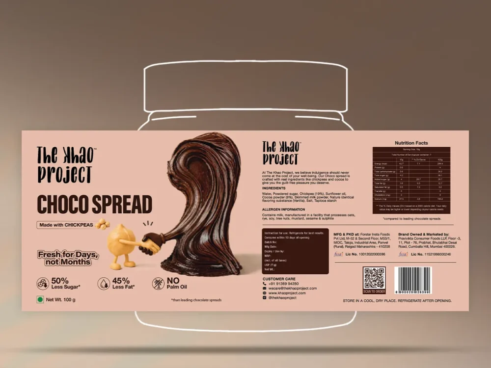
We built the label around one principle: indulgence leads, nutrition reassures. A rich, glossy chocolate swirl became the visual hero, with the brand’s key claims kept clean and scannable beneath it.
Chickpea as a Character
Instead of hiding the ingredient, we gave it personality. A playful chickpea character sits beside the hero swirl, turning the differentiator into something warm and memorable for children and parents alike.
A Range-Ready Label System
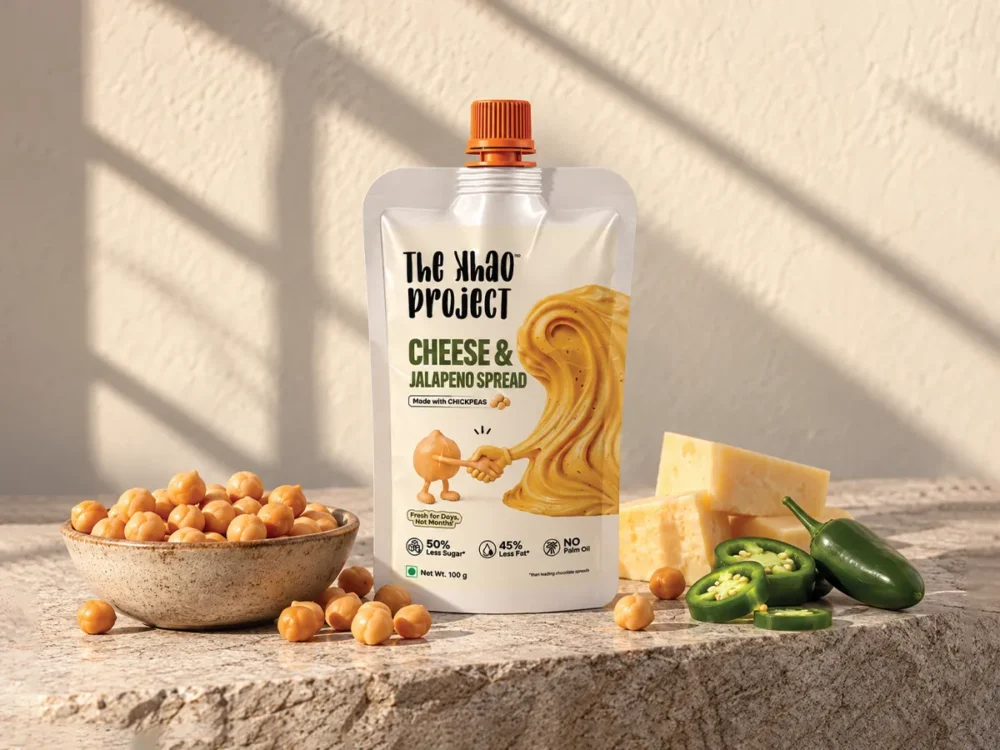
One system flexes across sweet and savoury, from Choco Spread to Cheese & Jalapeño Spread, and across pouch, jar and on-the-go formats. Consistent typography, palette and claims lock-ups keep every product unmistakably The Khao Project.
Built for Business Outcomes
Differentiation
Stood apart from sugary indulgent spreads and clinical health brands.
Recall
A chickpea character and hero swirl gave the brand an ownable identity.
Credibility
One label system now carries the brand across flavours and formats.
Food Packaging Design: FAQs
What makes food packaging design work on a crowded shelf?
Clear hierarchy. Shoppers decide in seconds, so strong food packaging design leads with one reason to buy, usually appetite, and supports it with claims that can be read at a glance. For The Khao Project, that meant chocolate first and the chickpea story second.
How many design routes should a food brand explore?
Enough to see genuinely different strategies, not variations of one idea. We presented ten routes for The Khao Project, grouped by what each one led with, so the team could choose a direction rather than a decoration.
Can one label system work across products and pack formats?
Yes, if it is designed as a system from the start. Typography, palette and the claims lock-up stay constant, while the hero visual and flavour colour change. That keeps the range recognisable as it grows.
Does Umanshi design packaging for D2C and FMCG brands?
Yes. Umanshi provides food packaging design, label design and brand identity for D2C and FMCG brands, from early concept routes to print-ready artwork.
How long does a food packaging design project take?
It depends on the number of formats and review rounds. The Khao Project moved from ten concept routes to one refined direction, then into artwork for three formats, through a staged process of concepts, revisions and finalisation.