Introduction: The Revenue Drain You Can’t See on a Dashboard
You launched a great-looking website. Traffic is coming in. SEO seems to be working. But conversions? Still flat. Why?
The truth is, most websites don’t fail because of low traffic. They fail because of invisible design and development flaws that silently kill conversions. These flaws don’t show up in campaign reports, but they show up in your bottom line.
In this blog, we dive deep into the website design flaws that hurt conversions — the hidden UX cracks and technical issues that cost you real money every single day. And more importantly, we tell you how to fix them.
Flaw #1: Your Website Looks Good But Thinks Badly
The Problem
You invested in a beautiful design, but users aren’t converting. Why? Because it’s not about how it looks — it’s about how it thinks.
Pixel-perfect visuals often lack user logic. There’s no funnel clarity. No visual direction. Just a sea of content that looks good but doesn’t convert.

What the Data Says
Eye-tracking studies show users search for directional cues and clear actions before they engage with aesthetics. Clarity beats creativity when it comes to conversions.
How to Fix It
- Map user journeys before starting any UI work
- Build screens around actions, not assets
- Use design to drive intent — not just to impress
Flaw #2: Your Website Is Slow — And It’s Killing Conversions
Why Speed Matters
Website speed is a trust signal. It impacts not only UX but SEO and purchase intent. And the stakes are high.

The Numbers
- A 1-second delay in load time = 7% drop in conversions (Google)
- Mobile abandonment jumps significantly after the 3-second mark
Key Metrics to Monitor
- LCP (Largest Contentful Paint)
- TBT (Total Blocking Time)
- CLS (Cumulative Layout Shift)
- Server response time
- Image load weight
Technical Fixes
- Lazy loading for non-critical assets
- Minify CSS, JavaScript and HTML
- Use CDN and server-side rendering where possible
- Run regular audits via Lighthouse and PageSpeed Insights
Flaw #3: Mobile Isn’t Secondary — It’s the Main Event
What Most Brands Get Wrong
Still designing desktop-first? That’s a major flaw. With over 70% of traffic coming from mobile, a poor mobile UX is bleeding your conversions.

What to Watch For
- Tiny touch targets
- Broken form alignments
- Hard-to-navigate menus
- No sticky CTAs
Business Impact
Mobile bounce rate can be 20-30% higher if the UX is misaligned — especially for ecommerce and lead-gen sites.
Fix It Now
- Design mobile-first, not mobile-friendly
- Prioritize key action zones (thumb reach, single-column layouts)
- Avoid horizontal scrolls and hover-only interactions
Flaw #4: CTA Hierarchy is Broken or Nonexistent
Why CTAs Matter
A confused user never converts. Period. And unclear CTA strategy is often the culprit.

Common Mistakes
- Multiple CTAs on a single screen with equal weight
- No color or spacing distinction between primary and secondary actions
- CTA text that says nothing: “Submit,” “Click here,” etc.
Psychology Insight
Users need clarity, urgency and one path forward. Anything else creates friction.
How to Fix
- Create a clear visual hierarchy for primary and secondary CTAs
- Use contrast, spacing and animation to draw attention
- Make CTA copy benefit-driven: “Start My Free Audit,” not “Submit”
Flaw #5: You’re Not Using Behavior Data to Course Correct
The Gap
You’re designing and tweaking based on gut or stakeholder opinions — not user behavior. That’s expensive.

Tools to Use
- Heatmaps (Hotjar, Microsoft Clarity)
- Scroll tracking and form analytics
- Funnel analytics to detect drop-offs
- Rage click detection to spot frustration
Tactical Advice
- Run session recordings weekly
- Prioritize AB tests based on user behavior, not trends
- Use click maps to guide layout updates
Flaw #6: Forms Are a Black Hole of Friction
The Reality
Your forms are too long, broken on mobile or don’t provide real-time feedback. That’s why people abandon them.
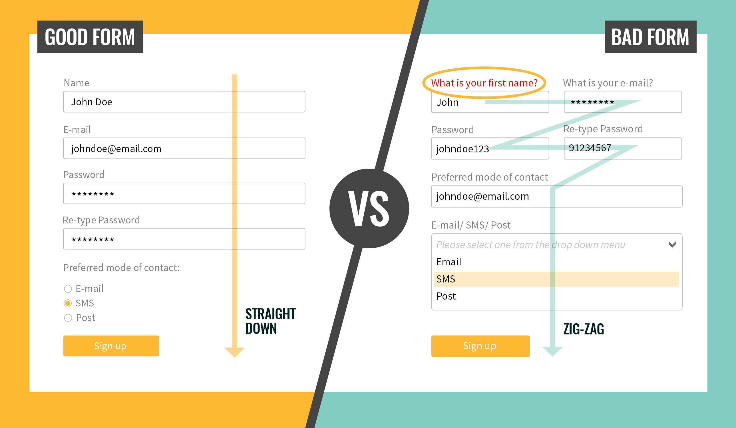
Revenue Impact
Forms are one of the highest-exit points on any website. Every bad form is a lost opportunity.
How to Fix It
- Use inline validation (instant feedback)
- Minimize required fields
- Add autofill + smart suggestions
- Use multi-step forms with progress indicators
Flaw #7: You Haven’t Tied UX Goals to Business Outcomes
What’s Missing
Your site might be beautiful and even functional — but if it’s not mapped to business goals, it won’t convert.
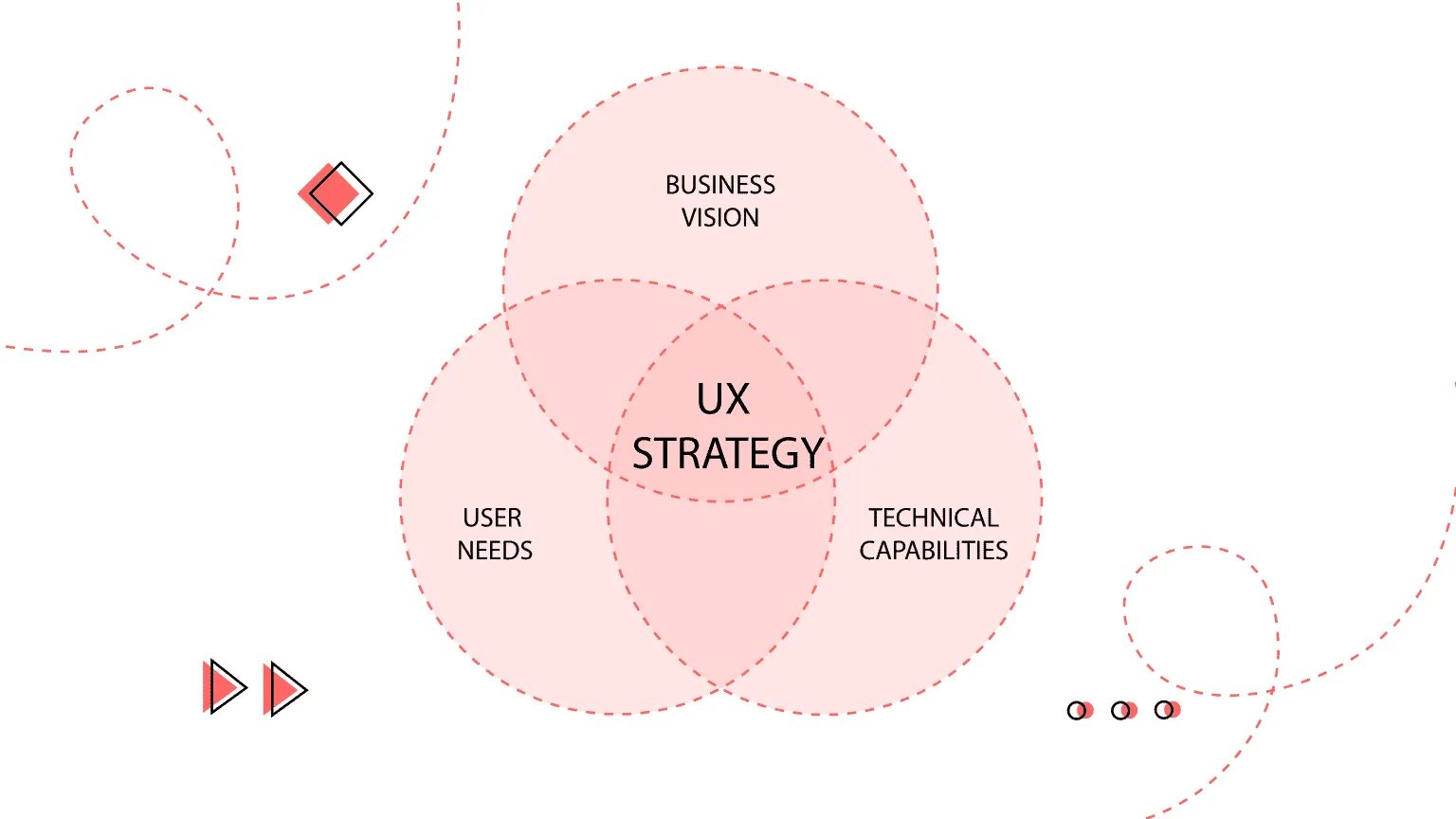
Strategy Moves
- Map UX flows to KPIs (leads, sign-ups, purchases)
- Design analytics dashboards to measure UX ROI
- Bridge your dev and marketing teams around common revenue outcomes
Quick Audit Checklist: Is Your Website Bleeding Revenue?
Use this checklist as a diagnostic tool:
- Load time under 3s on mobile
- Clear CTA above the fold
- Heatmap & scroll tracking installed
- Mobile usability score > 90
- No scroll dead zones or click traps
- Simplified, accessible forms
- Clear CTA hierarchy
- Minimal distractions per page
- Each page aligned with funnel stage
- Content matches user intent
Conclusion: You Don’t Need a Redesign — You Need a Diagnosis
You don’t have to tear everything down. Most sites don’t need a total overhaul. They need a smarter structure and data-backed design thinking.
Identify the leaks, fix what matters and turn your website from a passive brochure into an active sales machine.
Looking to diagnose your website? Get a revenue-leak audit from the experts at Umanshi.