Your Website is Bleeding Money — and You Might Not Even Know It
Most founders/ businesses we speak to have grown their business through hustle, networks, referrals, offline relationships and strong product-market fit… not their website.
And that’s exactly why the website gets ignored.
After all, if business is coming in anyway, why bother?
Here’s the part most people miss:
A website doesn’t just bring sales. It influences them.
It reinforces trust.
It accelerates conversations.
It qualifies leads.
It reduces friction for your sales process/ team.
It tells your story the way you want it told — without you being in the room.
Your company has evolved. You’ve launched new services, landed bigger clients and refined your positioning. Yet, your website is still telling your old story.
BTW , even if you’re in B2B and your website isn’t your primary sales engine, it is still impacting your pipeline more than you think — positively or negatively.
Let’s talk about the real leaks we see in over 90% of websites — especially in growing companies and how we help plug them.
The 5 Major Money Leaks (And How We Plug Them)
We’ve audited hundreds of sites. These are the five most common—and costly—issues we find.
Leak #1: Your Business Has Evolved. Your Website Hasn’t.
Most founders relate to this instantly.
Your offerings changed, your positioning matured, you added new services, expanded geographies, hired better people… but your website still reflects a version of your company from 4 years ago.
When your business outgrows your website, three things happen:
- Buyers don’t fully understand what you do now.
- You lose credibility before the first call even happens.
- Your sales team spends most of their time “correcting” the website narrative.
In B2B, this hurts pipeline quality more than anything else.
What founders usually say:
- “Our prospects assume we’re smaller than we actually are.”
- “People still think we do X, but we now specialize in Y.”
- “Our website doesn’t reflect our capabilities.”
How we fix it:
We realign your website with your current business, not the older version the web still shows.
That means a fresh narrative, updated service architecture, clearer messaging and a positioning that reflects who you are today.
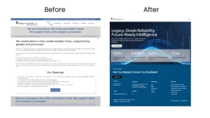
Bangalore Softsell – B2B
Leak #2: Your Website Doesn’t Support Your Buying Cycle
This is a big one — especially for B2B.
Most websites talk about the company.
But buyers care about:
- Their problem
- Their risk
- Their timeline
- Their next step
A lot of founders think the website doesn’t generate sales because “buyers prefer calls.”
What they don’t see is that the website is influencing decisions before and after every call.
If the site doesn’t help them move through the buying cycle — awareness → evaluation → trust → decision — they will delay, drop off or choose a competitor who looks more mature.
Reactions from businesses, we hear:
- “Our leads take too long to decide.”
- “People don’t understand our process or pricing.”
- “Prospects ghost after the first call.”
That’s not always a sales problem.
That’s a website support problem.
How we fix it:
We build pages and content that guide your buyer:
- Clear “Why us?”
- Case studies aligned with their scenario
- Simple service flows
- Trust markers
- Industry specificity
- Pages answering questions sales teams handle repeatedly
Your website becomes a silent sales assistant — supporting your pipeline, not sitting as a passive brochure.
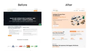
Inquitizy – B2B
Leak #3: “Looks Good, Works Bad” — The Pretty-But-Useless Trap
Many businesses do a revamp thinking design will fix everything.
But if the UI looks premium while the UX confuses people, you end up with a site that is:
- Hard to navigate
- Heavy, fancy and complicated
- Visually appealing but practically useless
- Full of clutter and zero direction
This is where credibility goes to die — no matter how good your product/ offering is. This happens in B2B as well as B2C where buyers expect clarity, ease and professionalism.
What founders tell us:
- “We just redesigned it last year… why isn’t it performing?”
- “People land but don’t take any action.”
- “Our site feels confusing even to us.”
The impact:
Confusion kills conversions.
And it kills trust faster than anything else.
How we fix it:
- We redesign with intention.
- Not “more colors, more icons, more animations.”
- But structure, flow, readability and a clear path for every visitor.
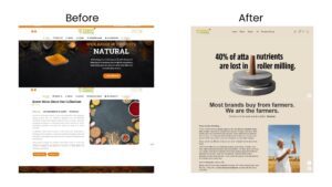
Sampusht Aaharam – D2C
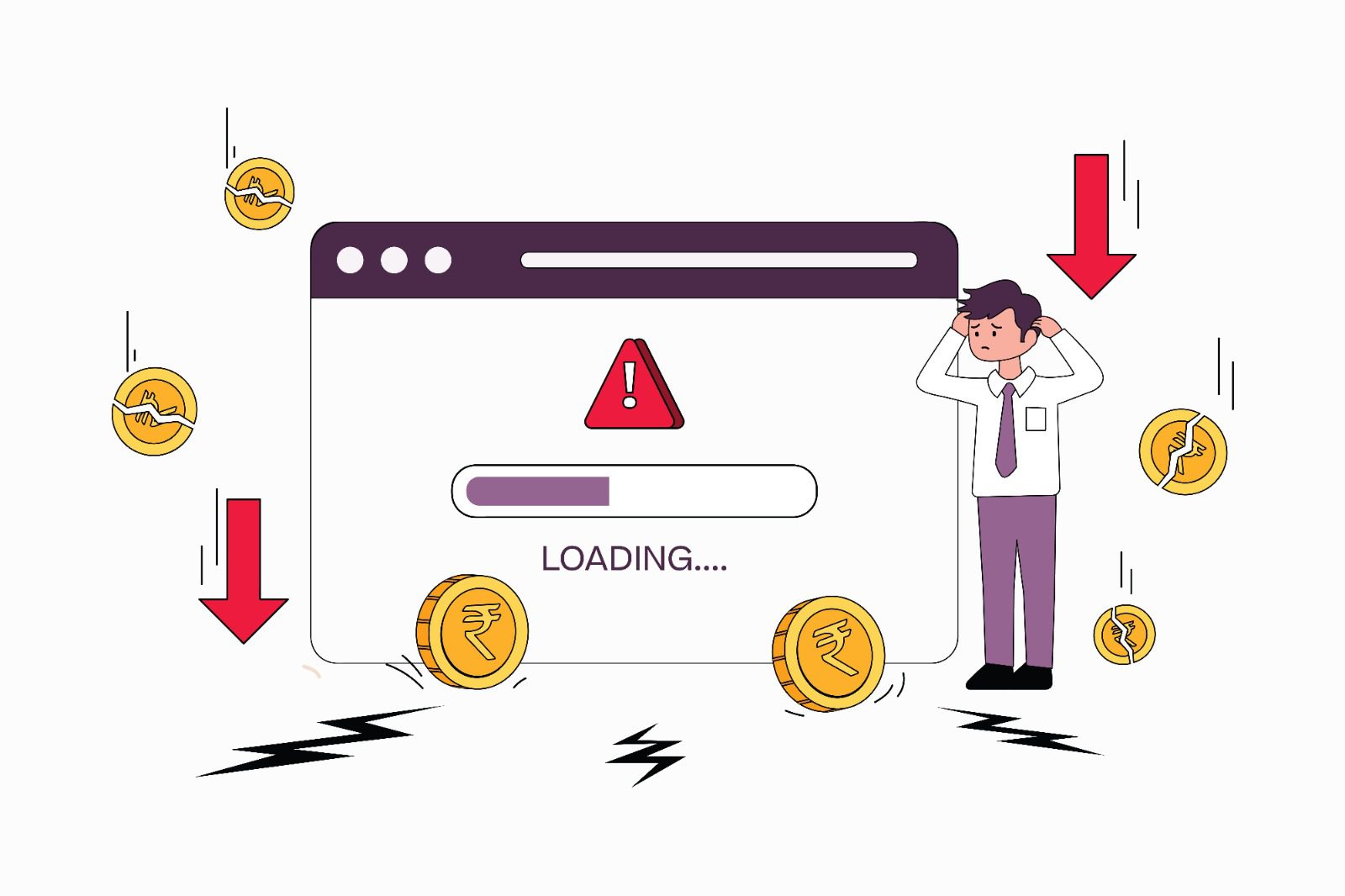
Leak #4: Your Website Is Paying the Speed Tax
Google calls it out clearly:
- If your page load jumps from 1s to 3s, bounce probability increases by 32%.
So speed is no longer a technical topic.
It’s a business topic.
Slow site = higher drop-offs, lower trust and poorer SEO visibility.
Even in B2B, your buyer subconsciously equates speed with reliability.
And nobody waits anymore — not even corporate decision-makers checking your site between meetings.
What businesses notice:
- “The site feels heavy.”
- “Our rankings are flat.”
- “People don’t scroll much.”
How we fix it:
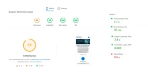
We focus on the Core Web Vitals that matter:
- LCP (how quickly the main content appears)
- TBT (how long the page is blocked before it becomes usable)
- CLS (how stable the page feels while loading)
Plus optimizations that boost business impact:
- Image compression
- CDN
- Code cleanup
- Render-blocking fixes
- Better hosting
This alone has improved conversions for several clients — even without touching the UI.
Mobile optimization is also part of this.
Over 60% of traffic comes from mobile devices.
If the mobile experience feels broken, credibility drops instantly.
Percivon – B2B
Leak #5: Your Website Isn’t Evolving With Industry, Design or SEO
Your business evolves.
Your market evolves.
Your buyers evolve.
But a lot of websites stay frozen.
Two common scenarios:
- The site is 3–5 years old and feels outdated.
- The site was made recently, but without awareness of current UX, SEO or industry best practices.
Both cause the same problems:
- Outdated language
- Old-school layouts
- No structured content
- Unoptimized pages
- Missing conversions
- Poor rankings
- Weak trust signals
Founders often say:
- “We’re not ranking even for branded searches.”
- “Our competitors look more modern.”
- “Our website doesn’t represent the company we’ve become.”
How we fix it:
We upgrade your site to match today’s expectations:
- Updated UX patterns
- Modern layouts
- Better content architecture
- SEO-structured pages
- Better messaging
- Clearer positioning
You get a site that feels current — not outdated — and one that actually supports your sales efforts.
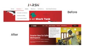
Jarsh – B2B
So… Do You Really Need a Redesign?
Maybe. Maybe not.
Most companies don’t need a fancy overhaul.
They need a strategic, business-aligned correction.
A few targeted fixes can:
- Improve credibility
- Shorten your sales cycle
- Increase lead quality
- Support the buyer journey
- Reduce friction for your sales team
- Bring clarity to your offering
- Increase conversions quietly, consistently
Your website is not a cost.
It’s an asset — if built right.
If it isn’t helping your business, it’s silently hurting it.
Ready to Stop the Bleeding?
If you want, we can run a Website Revenue-Leak Audit for you.
It’s fast, founder-friendly and gives you the exact fixes that’ll improve pipeline and conversions — without unnecessary spending.
FAQ Section
FAQ 1: How do I know if my website is affecting my sales pipeline?
If prospects visit but don’t enquire, ask repeated questions your site should answer or drop off after the first call, your website isn’t supporting the buying cycle. A quick funnel and user-flow audit will reveal where the friction lies.
FAQ 2: Do B2B companies really need an updated website?
Yes. Even if your sales come from relationships or referrals, buyers still check your website before deciding. A dated or unclear site reduces trust, slows decisions and makes your business look smaller than it actually is.
FAQ 3: What’s the fastest improvement I can make without a full redesign?
Start with clarity and speed. Update your key pages with current offerings, fix confusing navigation, improve load time and simplify CTAs. These small changes often lift conversions without touching the entire design.
FAQ 4: Why does website speed matter if my customers buy through sales calls?
Speed influences trust. Even B2B buyers judge reliability based on how fast your site loads. Slow pages increase drop-offs, hurt SEO visibility and create a poor first impression — often before your sales team even gets involved.
FAQ 5: How often should a business update its website?
Every 12–18 months, not necessarily with a redesign — but with improvements to content, structure, industry positioning and UX patterns. Trends, user expectations and search algorithms evolve quickly, and your site should too.
Top 5 Mistakes Businesses Tend to Make While Revamping Their Website
“My website is outdated.”
“My website doesn’t reflect my organization’s growth.”
“My website isn’t attractive anymore.”
“My website isn’t getting me sales, but I want it to support my sales process.”
These are some of the common reasons clients come to us for wanting a website revamp. But a website revamp done wrong can cost you dearly—missing the chance to build customer trust, lowering conversion rates and decreasing traffic. To get it right for our clients, we start by sending them a website brief questionnaire (leave your contact with us if you’d like to receive this website brief format).
We used our decades of marketing experience combined with business sense and technology trends to create a website brief questionnaire that helps us identify the 5 common mistakes businesses tend to make while revamping their websites.
Mistake 1: Telling What You Do Instead of Showing What You Do
Imagine a home page banner saying this:
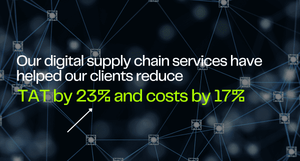
For a B2B brand:
- Option 1 - “We are a digital supply chain company that brings efficiency to your supply chain.”
- Option 2 - “Our digital supply chain services have helped our clients reduce TAT by 23% and costs by 17%.”
For a B2C brand:
- Option 1 - “XYZ is not just a brand but a promise of heritage meets modern trend.”
- Option 2 - “Reimagining the heritage of Sambalpuri Ikat, crafted for workwear.”
Which of the above two options would you choose and why? Let us guess: option 2, right? (Please tell us you did choose option 2 🥰) Here’s why we wouldn’t choose option 1 (and hoping our reasons match yours):
- It appears theoretical
- It’s generic, lacking specificity
- It creates a blind spot
And here’s why we’d choose option 2:
- It’s memorable—it’s essential that the website is memorable, especially if I’m a customer or prospective employee scanning several websites at once.
In short, demonstrate your promise or capabilities across your site, not just on the homepage: About, Product/Services, Careers, etc.
Mistake 2: Focusing Only on Customers
If you’re looking for a website revamp, it probably means your business is already established. This means focusing only on customer acquisition can be too narrow. Who else to focus on? Think about other stakeholders like prospective employees, service providers, investors and media.
For Example:
- Prospective Employees: Include a Careers page with team testimonials, benefits and actual team photos (not stock images)
- Service Providers: A section inviting supplier inquiries can strengthen your backend
- Investors & Media: Highlight milestones and media coverage to build credibility
A penny saved is a penny earned—an employee-friendly website can lead to direct job applications, reducing hiring time and ultimately benefiting your bottom line.
Mistake 3: Missing to Incorporate SEO
Working on SEO after the website is revamped is like doing your home’s Vastu after it’s built—only for the expert to inform you the bedroom and kitchen should be switched. Now imagine breaking down the website to make space for SEO.
A basic on-page SEO setup is non-negotiable today. Here are a few simple tips:
- Page Structure: Use various headings and header tags to give search engines a clear idea of what each section is about. Avoid multiple H1 tags, as they confuse search engines
- Content Length: Google expects at least 1500–2000 words per page to establish authority on a topic
- Keyword Distribution: Spread keywords across HTML tags (title, headers, meta descriptions) for maximum impact
Mistake 4: Prioritizing Aesthetics Over Performance
Won’t a visitor be impressed by a good-looking website? Maybe not, if it takes too long to load or isn’t mobile-friendly. Here are a few website performance metrics to consider:
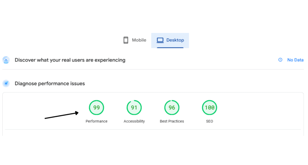
- Page Load Time: A 1-second delay can reduce conversions by up to 7%*
- Core Web Vitals: Focus on interactivity, usability and load time
- Mobile Responsiveness: Ensure the site adapts well across devices
To test site speed and core web vitals for free, check out Google PageSpeed Insights.
Mistake 5: Neglecting Technical and Search Engine Setup
We had a client whose 20-year-old website consistently ranked on the first page of Google. However, after a revamp (surely not by us!) that ignored technical aspects, their ranking dropped to the tenth page, resulting in a 90% traffic drop and loss of leads. Why? Google favors established sites and penalizes when changes aren’t SEO-friendly.
To maintain technical integrity:
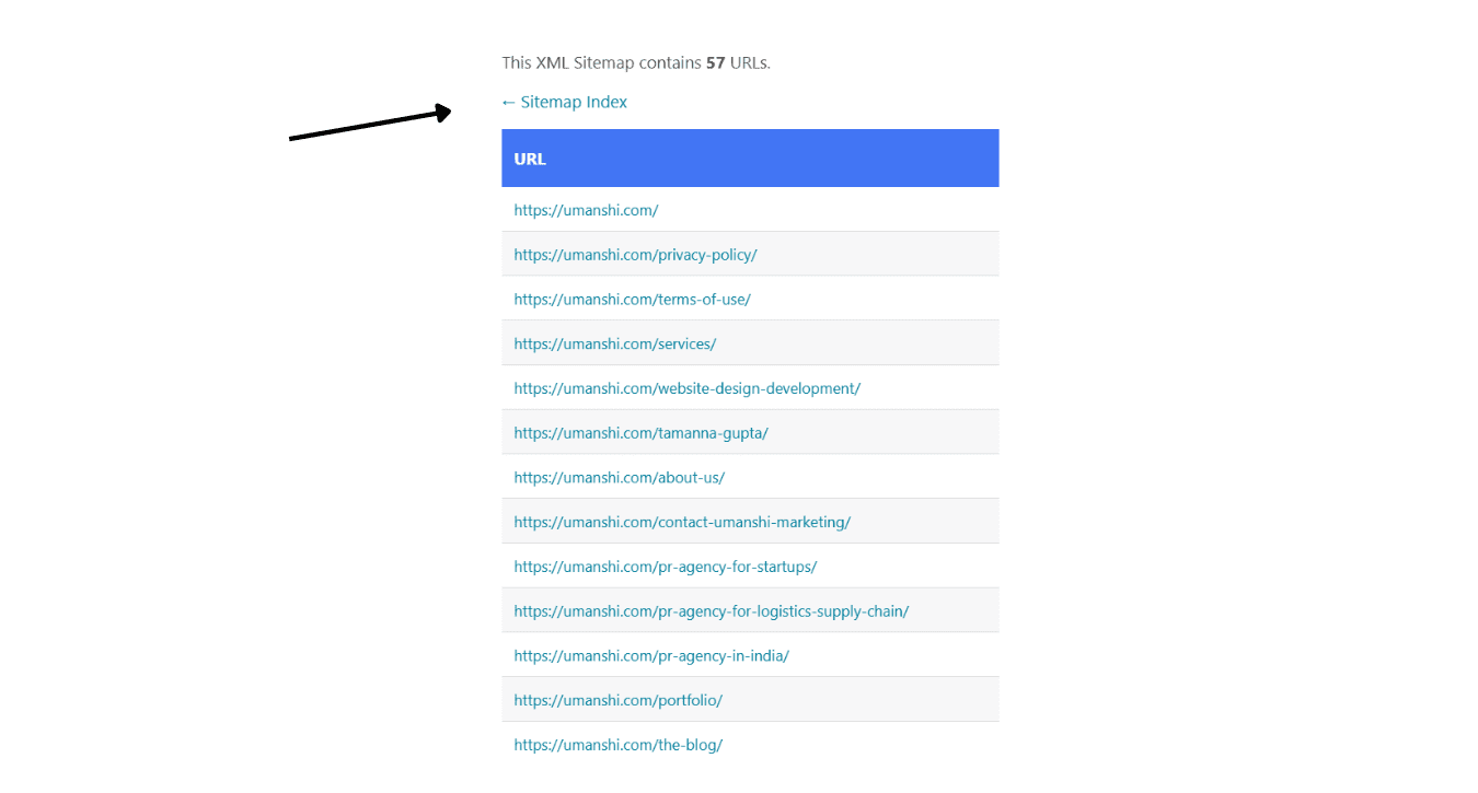
- URL Structure: Avoid renaming URLs unnecessarily to retain link equity
- Sitemap & Indexing: Ensure your site is indexed by submitting an updated sitemap to Google
- 301 Redirects: For changed URLs, use 301 redirects to keep the rankings
The above are just the tip of the iceberg. IYKYK there’s a lot that goes into a website revamp! By now, you would have realized that if you’re looking for a website revamp, we’re well-equipped to help! Do leave your contact details, and we’ll get in touch with you. Or refer us to someone who could benefit from working with us! 🤗
*Source:
Page Speed Conversion Data by Google
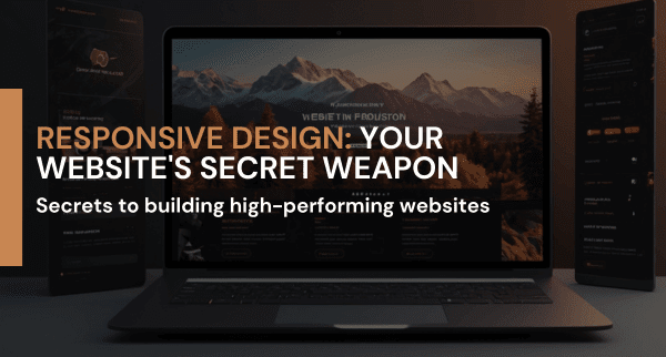
Responsive Web Design: Why It Matters and How to Implement It
In a world where attention spans are shorter than ever and screens come in countless shapes and sizes, a website that doesn't adapt is a missed opportunity. Responsive web design is no longer a luxury; it's a survival tactic. At Umanshi, we believe your website should be a digital masterpiece that captivates audiences across every device. We're not just building websites; we're crafting immersive digital experiences. Let's explore how our approach to responsive design can transform your online presence.
Why Responsive Web Design is Essential
1.1 Adapting to Multiple Devices and Screen Sizes
The mobile revolution has undeniably taken center stage. Today, more people are glued to their smartphones than ever before, transforming the way we consume content and interact with brands. Your website needs to look good and function well on various screens—smartphones, tablets, laptops, and desktops. A site designed only for desktops will appear distorted and be hard to use on mobile devices, frustrating users and driving them away.
1.2 Creating Superior User Experience (UX) Across Platforms
Imagine navigating a website that feels like it was designed for a different era. Pinch-zooming, scrolling endlessly, and squinting at tiny text are frustrating experiences that drive visitors away. Responsive design is the antidote. It's about creating a digital space where users feel effortlessly at home, no matter the screen size. By ensuring every element, from menus to images, adapts seamlessly, you're not just building a website; you're crafting a delightful user journey that fosters loyalty and drives conversions.
Core Principles of Responsive Web Design
2.1 Fluid Grid Layouts and Media Queries

Think of your website as a chameleon, effortlessly adapting to any environment. Responsive design is the magic behind this transformation. By employing flexible grids and harnessing the power of media queries, we craft websites that morph seamlessly across devices, ensuring a perfect fit every time. It's like having a skilled tailor meticulously adjusting your outfit to flatter your figure, no matter your size or shape.
2.2 Flexible Images and Scalable Vector Graphics (SVGs)
Your website's images are the digital equivalent of a first impression. A blurry, pixelated picture can ruin even the best design. That's why we obsess over image optimization. By employing clever techniques like max-width and embracing the versatility of SVGs, we ensure your visuals always look sharp, crisp, and stunning, no matter the screen size. It's like having a high-definition masterpiece that adapts flawlessly to any viewing angle.
Implementation Strategies for Responsive Web Design
3.1 Media Queries: Defining Breakpoints and Tailoring Styles

Media queries are the secret sauce that transforms your website into a shape-shifting marvel. By setting specific breakpoints, we create tailored experiences for each device. Imagine crafting a unique masterpiece for desktops, a sleek portrait for tablets, and a focused spotlight for smartphones. It's like having a wardrobe of perfectly curated outfits for every occasion, ensuring your website always looks its best.
3.2 Feature Detection and Progressive Enhancement

Your website shouldn't discriminate. Feature detection is the golden rule of inclusive design. By serving a solid foundation that works on every device and then gradually adding enhancements for those with the capabilities to handle them, you ensure everyone has a positive experience. It's like hosting a party where everyone feels welcome, but you have extra special treats for the guests who bring the best dance moves.
Benefits of Responsive Web Design for Businesses
4.1 Enhanced Search Engine Optimization (SEO)
In today's mobile-first world, your website is often a user's first impression of your brand. Google rewards businesses that prioritize mobile experiences by boosting their search rankings. A responsive website is your golden ticket to this coveted real estate. By delivering a seamless experience across all devices, you not only climb the search engine ladder but also simplify your website management. It's a win-win that no business can afford to ignore.
4.2 Improved User Engagement and Conversion Rates
A seamless experience is the holy grail of web design. When users can effortlessly navigate, discover, and interact with your content, they're more likely to stick around. This increased engagement is a search engine's dream, boosting your rankings and giving you a prime spot in the digital spotlight. Plus, a happy, engaged visitor is more likely to take the plunge and make a purchase or sign up for your newsletter. Brands like Zara have mastered this art, proving that responsive design isn't just about aesthetics; it's about creating shopping experiences that feel as good on a smartphone as they do on a desktop.
Best Practices for Responsive Web Design
5.1 Prioritizing Mobile-First Design

Mobile first is no longer a trend; it's a mandate. With the majority of web traffic now originating from smartphones, designing with the smallest screen in mind ensures a rock-solid foundation. By prioritizing mobile experiences, you're not just catering to the masses; you're setting the stage for an exceptional user journey that seamlessly scales up to larger devices. It's a strategic approach that mirrors tech giants like Google, who understand that a mobile-centric mindset is the key to unlocking the full potential of the web.
5.2 Optimizing Page Speed and Performance

Speed is the new currency of the web. Responsive design shouldn't come at the cost of a sluggish site. It's a balancing act that requires strategic optimization. By wielding tools like image compression, code minification, and the power of CDNs, we can create websites that not only look stunning on every device but also load lightning-fast. Companies like Yahoo have mastered this art, proving that speed and responsiveness can coexist in perfect harmony.
Conclusion
Responsive web design is no longer a luxury; it's a non-negotiable for businesses aiming to thrive in today's digital world. Your website is often the first impression customers have of your brand, and it's crucial that it makes a lasting impact, regardless of the device. A responsive design ensures a seamless, engaging experience that fosters loyalty, boosts search rankings, and drives conversions.
At Umanshi, we're passionate about crafting websites that not only look stunning but also deliver exceptional performance. Our team of design experts combines cutting-edge technology with a deep understanding of user behavior to create digital experiences that captivate and convert. Let's work together to build a responsive website that propels your business forward.
Contact Umanshi today to unlock your digital potential.
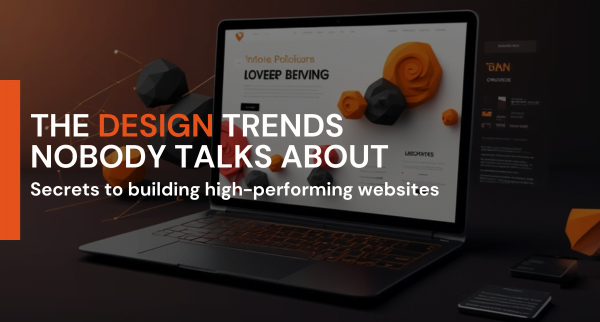
The Latest Website Design Trends in 2024
Website design trends are an ever-evolving field that mirrors advancements in technology, shifts in user preferences, and broader cultural trends. As we are well into 2024, staying ahead in website design trends is crucial for businesses looking to attract and retain customers. At Umanshi, we are pioneers in embracing these evolving trends, ensuring our clients’ websites are not just visually appealing but also functional, accessible, and at the forefront of innovation. Here’s a detailed look at the latest trends shaping website design for 2024 and how Umanshi leads the way in implementing them:
1. Dark Mode Dominance

Dark mode has become increasingly popular due to its sleek appearance and energy-saving benefits, particularly on OLED screens. In 2024, expect more websites to offer dark mode as a primary design option. This trend reduces eye strain, especially in low-light environments, and provides a modern, sophisticated look. By using dark backgrounds with contrasting colors and neon highlights, designers can create visually appealing interfaces that stand out.
Recommended For
Dark mode is ideal for tech companies, creative agencies, and online platforms that want to convey a modern and cutting-edge aesthetic. It’s particularly effective for brands targeting younger and tech-savvy audiences.
2. Neumorphism

Neumorphism, a blend of new and skeuomorphism, is gaining traction for its soft, extruded plastic look that is both minimalistic and engaging. Our design team at Umanshi utilizes shadows and highlights to create a 3D effect, making UI components like buttons and cards more tactile and interactive. Neumorphism offers a fresh, realistic touch that enhances the user interface, setting our clients’ websites apart from the competition.
Recommended For
Neumorphism suits brands that want a clean, futuristic feel. It’s perfect for startups, app developers, and companies in the tech or fintech sectors that aim to provide a high-end and user-friendly experience.
3. Minimalism with a Twist
 Minimalism remains a staple in web design, but 2024 brings new elements to this classic approach. At Umanshi, we incorporate bold typography, vibrant color schemes, and unique grid layouts to make minimalist websites more dynamic and engaging. This ensures that our websites stay clean and uncluttered while being visually stimulating and memorable.
Recommended For
Minimalism with a twist is ideal for fashion brands, luxury goods, and high-end services that wish to highlight their products or services with elegance and simplicity. It’s also great for professional portfolios and creative studios.
4. Micro-Interactions
 Micro-interactions are subtle animations that improve user engagement and provide feedback. These can range from a button changing color on hover to a smooth notification popup. In 2024, micro-interactions are becoming more sophisticated and integral to user experience. Our expert team at Umanshi integrates these seamlessly to guide users, improve navigation, and add an element of delight to digital interactions.
Recommended For
Micro-interactions are perfect for e-commerce sites, SaaS platforms, and educational websites that want to enhance user engagement and make navigation more intuitive. They are also beneficial for any website looking to improve user interaction and feedback.
5. Voice User Interface (VUI)
With the proliferation of smart speakers and voice assistants, Voice User Interface (VUI) is a significant trend in web design. VUI allows users to interact with websites through voice commands, providing a hands-free and convenient experience. At Umanshi, we lead the way in integrating voice search and navigation features, enhancing accessibility for a broader audience.
Recommended For
VUI is ideal for brands in the home automation, healthcare, and accessibility sectors. It’s also beneficial for media companies and content platforms that wish to provide a hands-free user experience.
6. Sustainable Design
 As environmental concerns grow, sustainable design is becoming more important in the digital realm. At Umanshi, we are committed to sustainable design practices. We create energy-efficient websites, use eco-friendly hosting solutions, and promote green practices, reflecting our dedication to responsible web design and a greener future.
Recommended For
Sustainable design is perfect for eco-conscious brands, NGOs, and companies in the renewable energy and green technology sectors. It’s also suitable for any brand that wants to demonstrate a commitment to environmental responsibility.
7. Inclusive Design

Zendesk products include these accessibility features:
• Clear navigation, page titles, and headings
• Keyboard shortcuts
• Image tagging and text alternatives
• Comprehensive links
• Color recognition
Inclusivity is a critical aspect of modern web design. In 2024, designers are focusing more on creating websites accessible to all users, including those with disabilities. At Umanshi, we prioritize inclusive design, using proper alt texts, keyboard-friendly navigation, and ensuring content is readable and understandable for users with cognitive impairments. Our approach broadens the audience and fosters a more equitable digital space.
Recommended For
Inclusive design is essential for educational institutions, government websites, and healthcare providers. It’s also beneficial for any organization that values accessibility and aims to reach a wider audience.
8. AI and Machine Learning
Artificial Intelligence (AI) and Machine Learning are transforming web design by enabling personalized user experiences. AI can analyze user behavior and preferences to deliver tailored content, product recommendations, and personalized interfaces. At Umanshi, we leverage AI-driven chatbots, dynamic content adjustments, and predictive design elements to make websites smarter and more responsive to user needs.
Recommended For
AI and Machine Learning are ideal for e-commerce platforms, personalized services, and content-heavy websites. They are also suitable for financial services and customer support platforms that aim to offer customized user experiences.
9. 3D Elements and Animations
3D elements and animations are improving web design by adding depth and interactivity. In 2024, more websites will use 3D graphics, interactive animations, and parallax scrolling to create immersive experiences. At Umanshi, our design team excels in utilizing these elements to capture attention, enhance storytelling, and boost user engagement.
Recommended For
3D elements and animations are perfect for entertainment websites, gaming platforms, and brands looking to create an immersive and visually striking experience. They are also great for marketing campaigns and interactive product showcases.
Conclusion
The trends in website design for 2024 emphasize the importance of user experience, accessibility and technological innovation. At Umanshi, we are dedicated to staying ahead of these trends, ensuring our clients receive top-tier website design and development services. By partnering with Umanshi, you can be confident that your website will be relevant, competitive, and reflective of the latest advancements in web design.
Stay tuned to our blogs for more insights and updates on web design trends. Feel free to contact us if you need assistance with your website design and development project.
